Campaign Monitor
Re-imagining
image editing
Replacing a bloated plugin with live and non‑destructive refinement.

Summary
Working against a fixed 6-week deadline, we cut features by 80% and delivered a more effortless experience that increased overall usage by 20%.
My responsibilities
- Customer research (with PM)
- Technical research
- Concept sketching
- UI design and prototype
Background
Campaign Monitor’s email builder launched in 2014 as the easiest way for designers and marketers to create beautiful email campaigns that work well in fussy email clients like Outlook and Gmail.
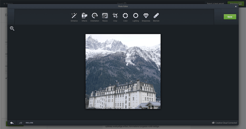
In September of 2018, I was tasked with solving a rather urgent problem: by November, Adobe would be shutting down Aviary, the plugin powering the image editor built into our email builder.

Through the Aviary integration, people could make simple edits to their photos—adjust lighting and colors, resize and crop, and apply effects—all without leaving the email builder. It was used by 38% of all active users, so we knew we didn’t want to let it die without offering a replacement. We also didn’t have a lot of time to get it right.
The obvious replacement
Beyond the fact that its days were numbered, I was already aware of a few other issues with the existing Aviary integration: it was slow to load, required many steps, and it reduced the quality of edited images.
We also knew about an enticing alternative: the PhotoEditor SDK had emerged as a popular Aviary competitor, promising better performance, more editing flexibility, and higher quality output.
Comparing it to Aviary, switching to the PhotoEditor SDK seemed like a no-brainer. But first, we wanted to make sure we were solving the right problem.
Uncovering the customer struggles
To get a deeper understanding of the struggles our customers were experiencing, the PM and I ran a round of interviews. We asked about their overall process for preparing image assets and planning multi-channel campaigns and how Campaign Monitor fits into this workflow. And we dug into the situations when they would reach for the Edit button to launch the image tools.
The biggest takeaway we kept hearing was that, when working with images in their email, our interview subjects rarely needed to adjust the colors or sharpness, etc. Either their assets were already good to go, or they preferred their usual workflow in tools like Photoshop.
When they did need to edit an image in their email, it was usually to make it fit into the surrounding content. They would scale an image down to better balance its size against the accompanying text, or they would crop it to match the aspect ratio of an image next to it.
This finding correlated with our usage data, which showed that resizing and cropping made up 90% of all edits done through the Aviary integration. Most customers hardly ever touched the other eight tools.
- Resize 59%
- Crop 31%
- Orientation 3%
- Lighting 2%
- Enhance 2%
- Sharpness 1%
- Color 1%
- Effect <1%
- Blur <1%
- Blemish <1%
But because the Aviary integration opened in an overlay covering the email content and didn’t show the edited image in its context until edits were saved, fine-tuning the composition when resizing and cropping could take several attempts—each time opening Aviary, clicking Resize, entering a size, and then applying it before saving.
To make things worse, editing would always start from the last saved version, not from the originally uploaded file. At this time, the email builder didn’t yet have an Undo button. So if an image had been cropped too small or scaled down too much, the only way to recover was to upload the image again and start over.
All this friction got in the way of the fluid experimentation that’s often needed to achieve the perfect composition.
Defining the job
The outcomes from our customer research could be summarized as:
When I add an image in the email builder,
I want to effortlessly experiment with resizing and cropping
So I can make the image fit beautifully with the surrounding content.
With this clearer understanding of the progress the customer was trying to make, it was obvious that a like-for-like replacement of Aviary was not the ideal we should aim for. Now with 80% of the original features removed from the requirements, we were freed up to build better fitting solutions to the problems that mattered.
In-context, instant resizing
In coming up with a solution for resizing images, I already had some building blocks to work with.
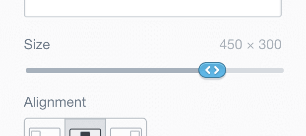
When users uploaded large images, we would silently resize the file behind the scenes, to a size that balanced a decent image resolution against a reasonable file size. We also already had a way to resize an image: users could scale the template’s logo image using a slider in the sidebar.
I briefly considered a few options for resizing the image inline with drag handles in its corners. But after some sketching, I concluded that reusing the sidebar slider from the template logo would give users more control over the image size across mobile and desktop screens. Reusing this pattern also meant more consistency and less building costs.

However, there’s a key difference between logos and images in the email builder: the logo always sits in a single column, while image blocks can be dragged to columns of different widths. I recognized that this had big implications on how the image size behavior felt in the hands of the user.
To get this to feel just right, I built an HTML prototype of the image resizing experience where I could experiment with different rules and behaviors for the size of images when moved between columns.
(Works best on a larger screen.)
Working with a live prototype gave me confidence in several decisions:
The slider’s minimum value should be 1px, and the maximum should be either the column width or the uploaded image’s original width—whichever is smaller.
If you resize an image from 500px wide to 300px wide, and then drag it from a 600px wide column to a 200px wide column, the image needs to scale down from 300px to 200px to fit. But if you then drag it back to the wider column, you don’t want it to stay 200px wide or reset to the original 500px. You want it to revert to the 300px that you manually set it to.
If you then drag that image to a 400px wide column, resize it to 400px—the maximum allowed in that column—and then drag it back to the 600px column, it should reset to the original image dimensions. To make this behavior more explicit, I made it so that when an image was resized to fill the column width, the value displayed as “Full width” instead of the pixel width and height.
If you give an image a fixed width but move it to a column where it takes up the full width, the fixed width is still remembered in the background. Only if you explicitly change an image to full width does this behavior reset.
As I have just demonstrated, these behaviors can be hard to explain and understand in writing. So the prototype would later prove useful when communicating with the engineers and testing the final implementation.
Playing with the prototype, I also found that it would be useful to add keyboard support to the slider, to make it easier to make precise, pixel-level adjustments.
Ultimately, skipping the heavy plugin experience and providing a live and immediate resize control made it much easier to find the right size for each image.
A native cropping experience
For image cropping, my job was not to reinvent the cropping interface, but to integrate a familiar tool in a way that saved our users time and effort. If you’d ever cropped an image before, you should be able to use this tool too.
Unlike resizing, it turned out not to be feasible for cropping to happen in context, since the constraints of email design didn’t allow for easy control over position, aspect ratio, size, and what was actually in the crop region, all at once.
Instead, I opted for the crop tool to transform the email builder interface into a cropping workspace.

Building on the existing structure, and using animations to transition between modes, helped maintain the context.
When going back to crop an already cropped image, it would open the original image file, but with the last selected crop region active. This made cropping non-destructive, as the user could always go back and keep tweaking, without the risk of losing their work.
Like with resizing, I decided to build a realistic prototype of the cropping interface to get a better feel for the finer points of the experience.
Play with the cropping prototype
(Works best on a larger screen.)
Compared to Aviary, there was less friction (time, effort, and risk) involved in cropping an image. But you still couldn’t see how the final image would look in the email while you were cropping it.
Prompted by a comment that came up in a review session, I came up with a split-screen solution, showing a live preview of the image in-context next to the cropping tool.
Play with the split-screen cropping prototype
(Works best on a larger screen.)
With the split-screen added to the prototype, it was clear that seeing the result live while editing would take most of the guesswork out of getting the crop just right.
Shipping, learning, iterating
Our improved image resizing and cropping both went live before Adobe pulled the plug on Aviary, so there was no interruption for users. For cropping, we initially launched an interim version without the split-screen to make sure we made the deadline.
We barely got any complaints about removing the low-use tools. Overall, the customer response has been overwhelmingly positive.
I love the new photo cropping and sizing. That saves me an enormous amount of time. Thank you for making that feature so much better.
Email builder userCustomer Effort Score survey feedback
Although we removed 8 of 10 image editing tools, the two tools we kept were brought to the forefront and made considerably more usable.
As a result, usage went up by 20%, from being used by 38% of all active users, to 46%.
The approach we chose also leaves a lot of leeway for further iterations.
Some of the ideas from the prototype, we dropped from this release, such as an exploratory “suggested crops” concept which would analyze the image to suggest good compositions and areas of interest.
Our customer interviews also sparked other ideas for the future. For instance, letting designers apply and lock “styles” for images (aspect ratio, color tint, etc.), so when their clients use the template, they can change the image content but not the image styles.
By dismantling image editing into individual tools, we’re not locked into a third party and their way of doing things, but free to solve the customer’s problems with precision.
(Works best on a larger screen.)